
Color Tricks Every Pro Should Know
- Jan 30, 2018
- 3 min read
Color, or colour for our Canadian readers, is the key building block of any beautiful room. It is the element of design that can make or break a space. It is probably the most personal and intimate part of the process, because preference is based on so many things…such as life influences, memories, and experiences. The furniture may be fabulous, but in a color story your client doesn’t like, it will never work. The architecture may be amazing but painted in a color that makes them cringe…oh vey!
For over 40 years ago, I have had the pleasure of helping people create beautiful homes for selling and dwelling. At the beginning, my color expertise was based on my own “good eye for color” and let’s be honest…my personal preferences. I soon understood I needed to create color harmonies that touched my client, visually and emotionally. It wasn’t about me…not in the least. These years of experience led to the development of the Confident Color System. Here are some of my tricks I have used to stay in business all these years.
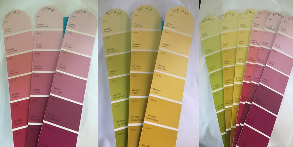
The Question You Should Never Ask-”What is your favorite color?” A color name or hue doesn’t tell the story, so this question will not help you. When I say red, all of you reading this will visualize a different red. Is it a rich warm red, a cool vibrant red or a neutralized red, which starts to move toward gray. You need to have a clear understanding of your client’s interpretation. Perhaps green is your client’s buzz color, is it an earthy green, a blue-green or a yellow-green? Define and clarify to find your jumping off color point in a room. The final color is determined by understanding the saturation level your client finds most appealing. In the photo you see 3 versions of red-violet and 3 versions of yellow-green, the difference is the saturation level. Which version is your favorite?
Establish the Ratio- Multiple rooms could have the same color story but feel completely different, because of the way the color was divided. The adage of 60-30-10 means one color will occupy about 60% (dominant) of the space, the second 30% (secondary) and the third color will be an accent or about 10%. This simple use of 3 colors works time and time again, as it is easy on the eye. By simply changing the proportion of the color, you can completely change the overall feel of the room, visually and emotionally.
Marry the Colors- Whatever your color story, something needs to make the color story make sense. That may be a rug, piece of art, textiles or furniture. By marrying the colors, the color story seems purposeful and intended. Look at these décor elements from Ballard Designs to see how they could help connect a color palette.
Use Value like Mother Nature- Color has 3 elements, Hue, (the color family) Saturation, (the intensity) and Value. (the lightness or darkness) When you look at a strip of colors in a paint store, they are typically lighter colors at the top of a strip leading to darker versions of the same color in the same strip. If you look outside, (unless covered by snow) Mother Nature used the deeper or darker values at ground level, leading up to light values in the sky. The transition from ground to sky, is interspersed with dark and mid-values in tree branches and flora colors. Use the same concept in your space, by keeping darker values low, such as floor colors, furniture, etc. But create balance with dark touches, such as darker frames, art or cabinetry.
Do the Unexpected- We have all heard it before, small room, you must paint it light. Or a dark room must be painted in light colors. Whoa, hold on there, do whatever you darn well please. My kitchen is small with one window that faces north…it is always dark. Whether my cabinets are white or black…I need to turn on lights even at high noon. Despite how dark it was, I painted my cabinets black and went for contrast. I used the classic combination of black and white with buffalo check wallpaper and black cabinets. The unexpected resulted in a much more interesting space. If I would have done the expected, the cabinets would have been white…and much less interesting.
There is so much more I would love to share, so come visit me at IWCE Tampa. In the interim, I hope these points help you approach color selection with more confidence.If you have any questions, feel free to contact me at joanne@thejlwcompany.com.
[if !supportLineBreakNewLine]
Credit:
JoAnne Lenart-Weary/Color and Decorating Authority
Interior Decorator and Staging Professional Training & Coaching for Staging and Decorating Professionals
Founder of The Decorating and Staging Academy
Creator of the Confident Color System
Comments